Introduction
It has been pretty challenging for me to style Angular Material Checkbox. The selector for the checkbox is mat-checkbox and it only offers the color input parameter. For my use case, I needed to make an outline variation of the checkbox. Hence, I had to change background color and the inner checkbox to satisfy the requirement. Since I could not find a solution online and since I spent a couple of hours on this, I decided to make things easier for you by providing a ready-to-go solution.
Implementation
To be as precise and straightforward as possible, here is an SCSS code snippet that you can insert into your SCSS file to make it work:
SCSS
@mixin outline-checkbox {
  .mdc-checkbox {
    .mdc-checkbox__native-control:enabled {
      &.checked,
      &:focus:checked,
      &:indeterminate,
      &[data-indeterminate='true'],
      &:checked,
      &:hover:checked,
      &:not(:disabled):active:checked {
        ~ .mdc-checkbox__background {
          background-color: transparent;
        }
      }
    }

    // Define the style for .mdc-checkbox__checkmark
    .mdc-checkbox__native-control:enabled ~ .mdc-checkbox__background {
      .mdc-checkbox__checkmark {
        color: red;
      }
    }
  }
}

.checkbox-item {
  @include outline-checkbox;
}
HTML
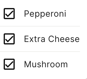
    <p class="checkbox-item">
      <mat-checkbox color="primary">Pepperoni</mat-checkbox>
    </p>
    <p class="checkbox-item">
      <mat-checkbox color="primary">Extra Cheese</mat-checkbox>
    </p>
    <p class="checkbox-item">
      <mat-checkbox color="primary">Mushroom</mat-checkbox>
    </p>
Of course, the encapsulation of the component is set to .None, to avoid the usage of ng-deep:
Typescript
encapsulation: ViewEncapsulation.None,However, you can use ::ng-deep if you prefer and if the above solution does not work for you.
Explanation
The styling is focused on two main parts of the checkbox component:
- The Checkbox Background: The
.mdc-checkbox__native-control:enabledselector targets the native control element of the checkbox, but only when it is enabled (not disabled). The nested selectors within this block apply the stylebackground-color: transparent;to the.mdc-checkbox__backgroundelement in various states:- When the checkbox is checked (
.checkedor:checked). - When the checkbox is in focus and checked (
:focus:checked). - When the checkbox is in an indeterminate state (
:indeterminateor[data-indeterminate='true']). - During hover over a checked checkbox (
:hover:checked). - When the checkbox is active (clicked) and not disabled (
:not(:disabled):active:checked).
.mdc-checkbox__backgroundin all these scenarios in a more concise and readable manner, reducing the repetition of the same style declaration across different states. - When the checkbox is checked (
- The Checkbox Checkmark: The style for the
.mdc-checkbox__checkmarkelement is defined separately. This part of the mixin sets the color of the checkmark inside the checkbox. The selector.mdc-checkbox__native-control:enabled ~ .mdc-checkbox__background .mdc-checkbox__checkmarktargets the checkmark that is a descendant of the checkbox background, which is in turn a sibling of the enabled native control. The color is set to a red, and this is obviously only for the demo purpose.
Conclusion
Overall, this solution provides a neat and efficient way to style the different states of a Material Design checkbox component, ensuring that the background of the checkbox turns transparent in various user interaction states, and defining the color of the checkmark. By using SCSS features like nesting and grouping of selectors, the code is made more maintainable and easier to understand. Let me know if this solution helped you! Read: How Angular Works Under the Hood?
Leave a Reply